Our blogs about year-end appeals triggered a handful of questions about the most important facets of an online donation form. This post covers a quick checklist of key things for you to ensure are working well.
Tick them all off to give your appeal the best chance of seasonal success.
A quick word about tracking
Before we leap in, we’d be remiss if we didn’t mention the importance of tracking! How much oversight do you have of your form’s performance? Data is so key to being able to read your donor’s journeys, touch points and sticky moments. There’s clearly no point delivering traffic to a donation form without being able to track its conversion and impact. Make sure your analytics platform or Google Analytics (GA4) is set up to track donation conversions properly! Need some tips on this? Please get in touch with us and we’ll happily share best practices.
Back to the Christmas checklist…
These aspects of a donation form are equally as important for your cold (new donors) as they are for your warm (existing donors) visitors. First the checklist; then some notes to explain the importance of these items!
- Does your form have a quarantined navigation?
- Is your form highly optimised for mobile-using donors?
- Are you offering mobile-friendly payment routes?
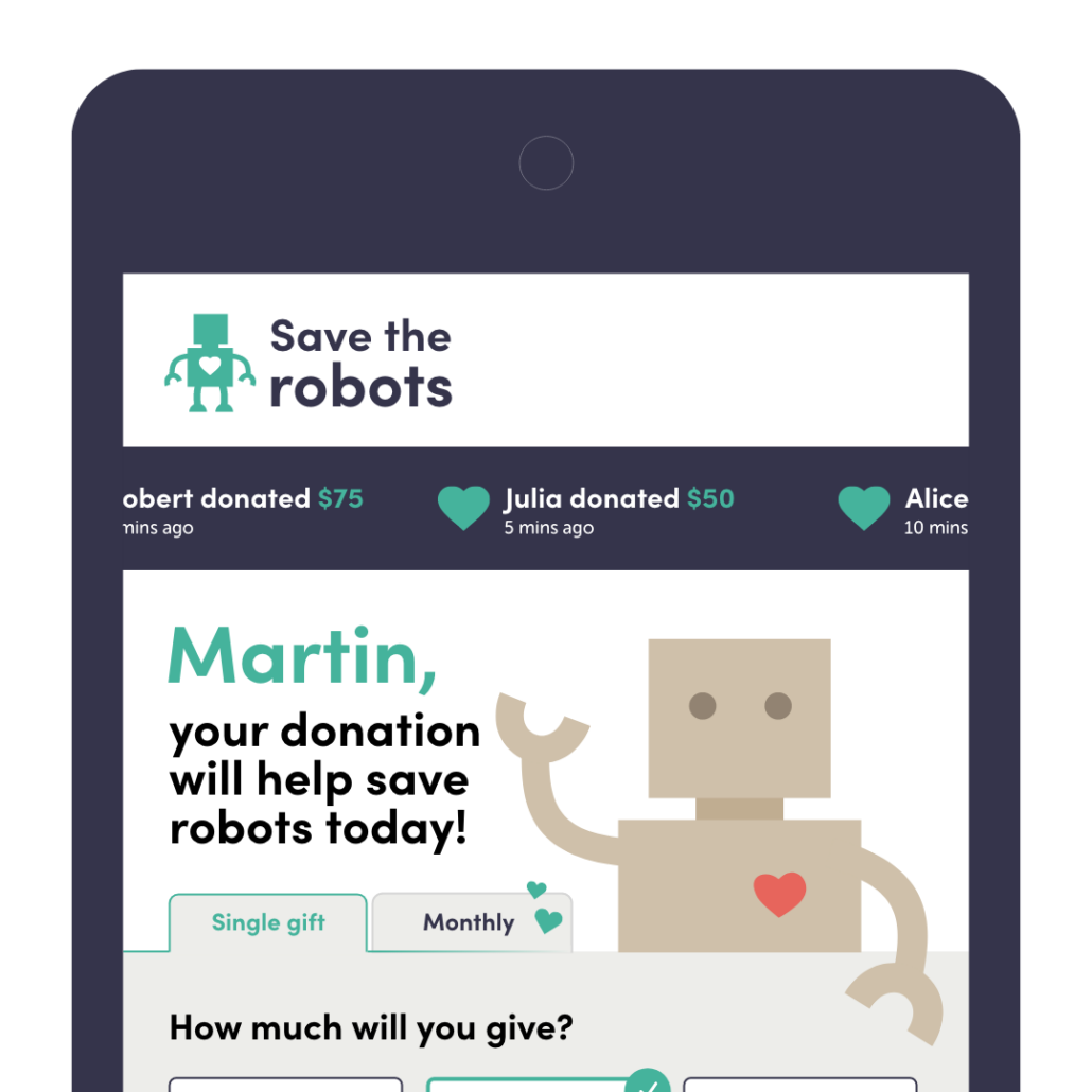
- Are you welcoming your warm leads with a personalised form?
- Can donors see social proof to inspire them?
- Does the form use images effectively?
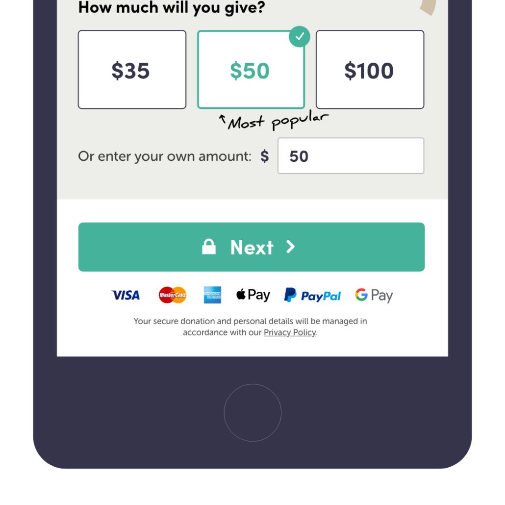
- Are you keeping choices to a minimum?
- Is a donor’s impact clear?
- Do you answer the key question: how much should they give?
- Does your form reassure people that their payment is secure?
- Have you let your donors know the payment types you accept?
- If you seek monthly contributions, are you promoting this route?
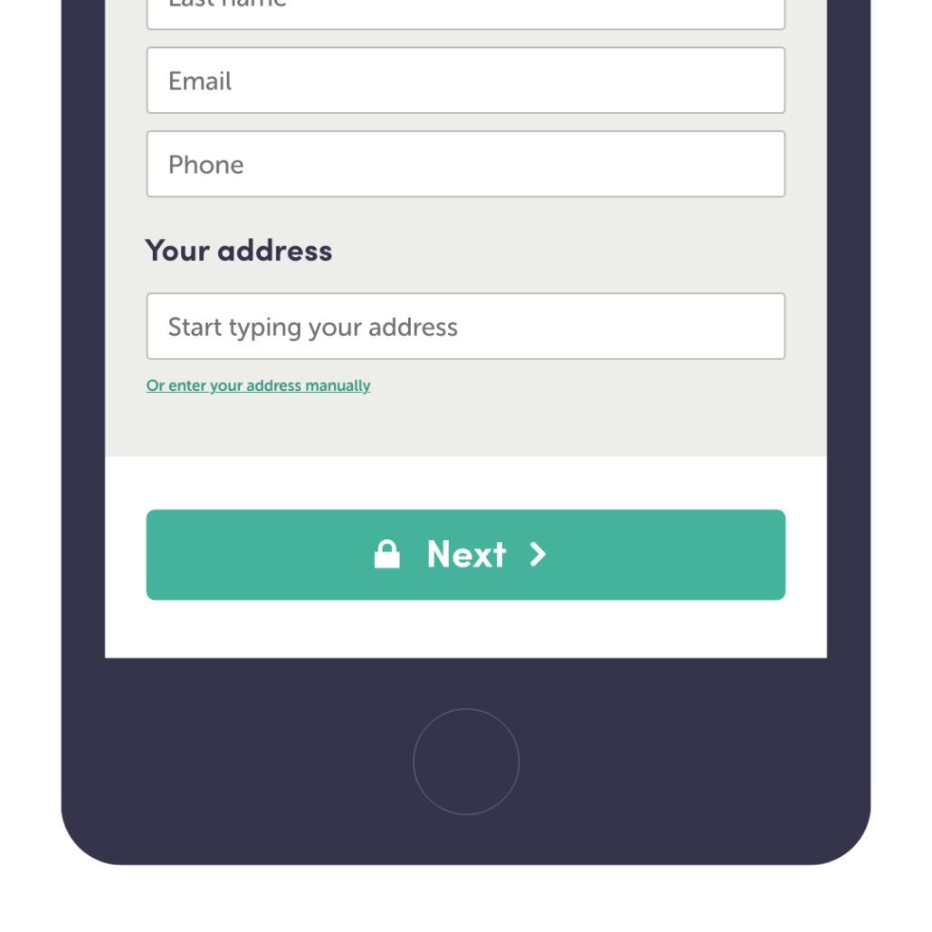
- Are you collecting the minimum amount of personal data?
- Are you using address look-up?
- Can a donor opt to keep in touch with you?
- Do you declare that you will manage their data carefully?
- Is the donor thanked personally and appropriately for their gift?
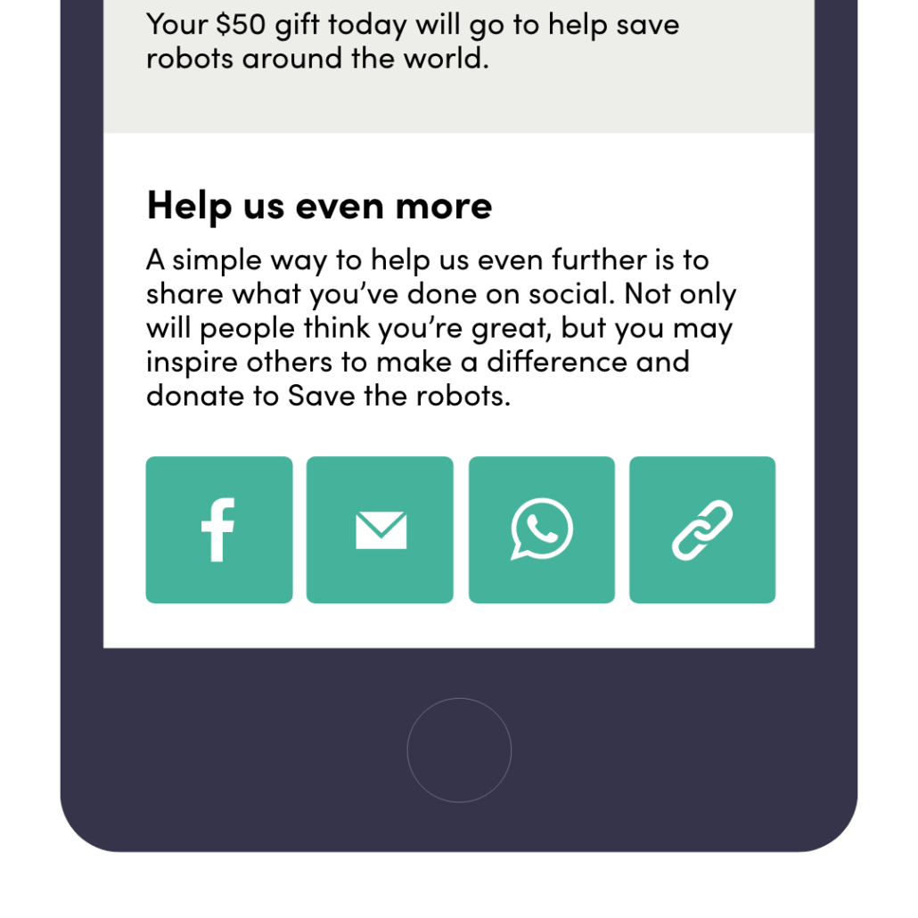
- Can a donor easily share news of their contribution on social media?
- Quarantined navigation
Once your potential donor reaches your form, you want them to stay there and finish the process of making a donation. Removing your normal site navigation reduces distractions. This can sometimes have the magical effect of doubling form conversion rates. Which means the distractions HALVE the performance of your form. - Donor context
All our clients see 60% to 90%+ of their traffic arriving on mobile devices. Does your form look a little sketchy and fail to be responsive on smaller screens? Are fields hard to fill in? Buttons too small to select? Every barrier is costing you money. Review the design and experience on mobile BEFORE you sign it off on desktop. - Mobile-friendly payment
Are you offering the most popular types of e- / m-wallets, PayPal and Apple Pay? Donors often prefer to pay using these routes, which can represent up to 40% of your income. Their absence directly reduces conversion and income.
- Personalisation
Another hugely powerful, but often overlooked aspect – welcoming your warm donors by name. This can lift their conversion rate by more than 2x. Set up PURL appeal links in your marketing materials. But first, shape the top of the donor journey to welcome donors back, personally.

- Social proof
Each additional social proof element lifts conversion by reassuring donors: a recent donor scroll; trust marks related to your cause; a totaliser for the appeal; stats for donations in the last hour / day / week; a quote from a donor or ambassador. - Effective images
Lead with an image of an individual beneficiary facing the camera. This helps make a quick sense of connection between the beneficiary and prospective donor. Running digital ads for your appeal? Or sending out DM / eDMs? Match the imagery used in all parts of the journey. - Minimal choices
Humans easily get overwhelmed by choice. 3 or 4 items in a gift array are often plenty. Test more or less before you break the ‘rule’. Aim for rounded amounts UNLESS they are specific prices of an intervention. Always provide a donor with the opportunity to add their own amount. - Clear impact
Ideally share insight above the gift array, as part of the welcome statement, as well as, if practical, within the gift array. In some cases amounts work well on their own if the work of the organisation is well known. Otherwise (VERY) short statements work best. When writing them consider how fast they are to scan on mobile.
- How much?
Many donors are unsure how much they ‘should’ give. Help guide them by pre-selecting the middle value from your gift array, basing this on the average donated by others or the level of their recent donation if they are a warm lead. Annotate this amount with ‘most popular’ as well, ideally in a cursive / hand-writing font.

- Reassure repeatedly
No one wants to be caught out by online fraud. Reassure donors that their payment data will be handled safely. (See below for personal data too.) Display relevant trust marks (think payment processors, not the issuer of an SSL certificate). Simple visual cues such as a padlock icon on each CTA button also noticeably lift conversion. - Payment types
It is frustrating for a donor to complete the whole process and find their preferred card type, or the one they have close to hand, is not accepted. Declare the card issuers and e- / m-wallets that your form accepts on the first step. This helps prepare a donor, and reduce ‘dropped basket’ rates. - RG prompt
If your marketing leads with an RG ask, default the donation form to this mode. If your marketing leads with a single cash gift, don’t try to upsell before the donor has even started. Consider additional flourishes on the RG tab / choice to attract attention to it. Also consider an interstitial up-sell or post-transaction up-sell. - Minimal data
It is valuable to streamline data as much as possible. Do you need that ‘Title’ field? Does the answer you collect to ‘How did you hear about us?’ really help with accurate attribution in a world of multi-channel marketing? Strip away unnecessary data capture, mindful of the need to keep in touch or reduce fraud via AVS.
- Speedy entry
When you do need to capture an address from your donor, offer access to a look-up service. It not only helps a donor complete the task faster while reducing cognitive load and friction. It also provides you with cleaner data, which is better formatted and more likely to match existing records in your CRM.

- Keep in touch
Simplify opt-ins and ensure the intent of all possible statements is the same, i.e. they are all opting in / out. Not a collection where a ‘tick’ means yes to some and no to others. Craft a compelling personalised welcome that details the impact of a gift. - Managing personal data
Are you declaring your Privacy Policy and your intent to manage personal data professionally, in line with local best practice? This reassures people when they are sharing their personal details, and overcomes objections / questions in real time. - Thanking nicely
Alongside important transactional minutiae such as an ID for the donation, make the thank you screen reflect the donor’s name, amount and impact. Introduce the donor to other propositions or the point of contact who will be sending them a welcome journey.
- Social sharing
While not every donor uses this interaction, the ones who do are freely promoting your appeal or cause to their network. In some cases the network will share a common connection to your cause. This leads to highly effective word-of-mouth referrals which tend to convert well.

How does your form score?
Full marks? Brilliant news, your appeal should be converting as many leads as possible. Half marks? There is time to update things to make a significant change to the performance of your year-end appeal. Low marks? It is worth considering whether the better approach might be to find a new form experience, especially if the blockers are baked into your current provider’s platform.
Good marks but low conversion rates? We would aim to get a form to convert over 30% of qualified traffic. Your results might indicate poor quality traffic, or a less obvious hindrance to completion such as legacy log-in steps or slow page load times.
We’re here to help! Let us know how your form scored – you can use our handy festive checklist! Feel free to reach out and ask us to do a quick review to indicate the top 2 or 3 tweaks which might unleash remarkable results!
Good luck out there fabulous fundraisers!
